Wow, I’ve kind of dropped off the edge of the earth and missed making my self-imposed blog posts. For the past week, I was consumed (really eaten up) by a project. A friend asked me to read through her book manuscript for repetitions, incongruities, and more. Yes, a whole book – 300+ pages.
Along with studying ballet, working in museums, and teaching at University, I also do editing. Most of the time, it’s been pro-bono, professional development work. That means work without pay. Let’s see, for the international ethnographic museum organization I’ve been a member of seemingly all my life, I’ve copy-edited 3 books of articles by colleagues from around the world as well as put out the newsletter when the editor disappeared. I’ve copy-edited several journals from Jewish studies to Chickasaw history, and more, I’m sure. In addition, I serve on editorial boards of mostly of museum-oriented journals. At the heart of these efforts is a modicum of knowledge (you’ve got to know something), and a joy of reading and learning mixed with a soupcon of attention to detail.
Well, my head’s out of the water now after the most recent project. I sent a very red document filled with many comments, questions, and suggestions (thanks to track changes) to my colleague. It’s an interesting book about a fascinating, little known subject related to a Jewish community during World War II. I’ll let you know when you can get your own copy at your local bookstore.
So, back to CreativelyAnnette. Yes, I’ve been cooking in the interim and also museum going. Both activities get my creative juices going – whether the art of combining ingredients into an appreciated meal or stimulating my thoughts about my professional craft – museum work.

Back to editing and Museum Musings … When I was learning my professional craft (and teaching it, as well), one phrase stuck with me: “An exhibit is not a book on the wall.” More recently, a word knocking around the museum world is “Storytelling.” It’s somewhat ironic that with my folklorist hat on, I’ve not collected tales, what laymen frequent connect with the term folklore. In the museum arena, however, I promote the effective sharing of information, another form of storytelling.
People come to museums to see things that attract them visually and intellectually. One goal of a successful exhibit is for visitors to take home something new or add to their knowledge, to ignite their interests, to spark their curiosity. This is usually accomplished with well-written label texts.
Caveat … generally, two types of labels accompany items in museums. The object label provides information about what you’re looking at – title, date, artist, medium, donor (they like their names out there, etc. Interpretive labeling is the storytelling device. All sorts of information can be conveyed on this relatively small text near the object.
Guidelines exist with regards to interpretive labels. Recommendations address font and print size along with print and background color, all of which contribute to ease of reading. Other suggestions about the length of text – remember, it’s not a book on the wall. Viewers who wish to learn more can buy the catalog, go to library, use Google. Some museums have embraced the QR code as a way to convey addition information.
The handicap of taking a busman’s holiday, that is returning someplace like your workplace on your time off, is that it’s difficult to remove your critical eye. Perhaps my exhibit viewing pleasure is impacted from my habit of looking with the eye of a curator and editor. Here are some examples of text labels I’ve encountered recently. Frankly, I told Constant Companion (who also dissect labels) in our most recent to a local museum, that I rarely attempt to read labels anymore! I look at the art or objects.
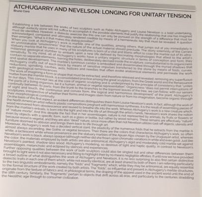
To start, here is an extreme example of the book on the wall: too much text, no separation of paragraphs, font is too small.
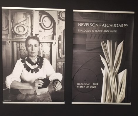

From the macro to the micro, here are some actual interpretive labels: for me this is simply too much text. I also found some of what was written to be questionable.
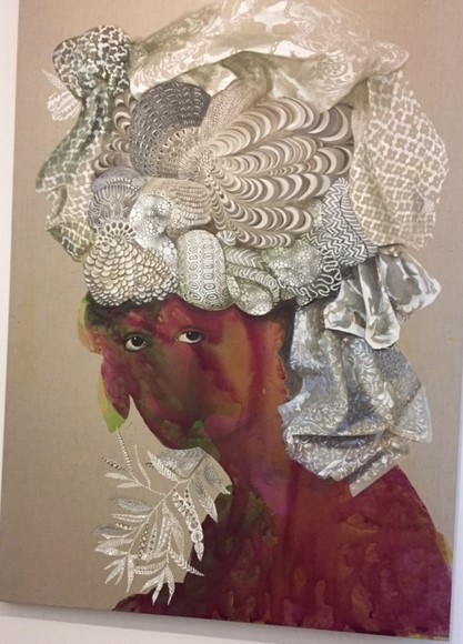
The “subject is painted with yellow and ruby swatches of color.” So what? Do these colors carry any meaning? Reading further down in the long label, we see that, “… the figure’s gaze communicates a sense of authority …” But why is the figure’s face is incomplete? Again, does that carry any meaning?
Now, if you can get that far in this very long label, look again at the sentence that starts with, “Here, the figure’s gaze …” What a long sentence about her “sense of authority,” “the history of women,” (that’s enough there), who “had an apologetic approach,”and “decorate their headdress” … all “In the painting. ” Do you see this in the painting? I see the headdress, but wonder why the profusion of different and intricate patterns on the cloth.
Here’s another instance of labeling to consider. Kehinde Wiley is a well-known contemporary artist. Among other images he’s captured is the official portrait of President Barack Obama. Here’s what I saw at the recent museum visit – painting and label:

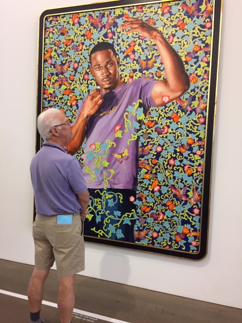
I’m sure you’ve picked up that I’m not a fan of overly long interpretive labels. Along with length, I look at what is written and if the words represent the image and help me see into it better.
Elsewhere in the museum was a small exhibit of a recent acquisition of self-trained (folk and a bevy of other descriptors) artists. The majority of these artists are African-American, following the mandate of the museum to add to the repertoire of work by African-American artists.
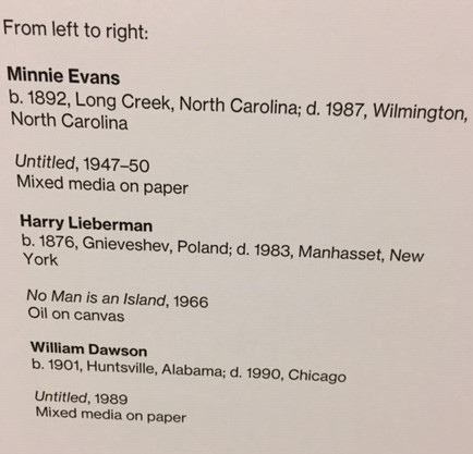
The exhibit highlighted work by artists “Most [of whom] overcame hardship, particularly those living in the Deep South during the Jim Crow era.” And yet, a handful of the artists were not Black, from the American South. This label is the only information about Harry Lieberman, whose autobiographical paintings recall his memories of life as a Jew in Poland. The artwork was shown in a short wall nestled among the works of two known African-American artists. It’s either a curatorial decision or that of the designer, but why were the non-Black artists grouped together?
In addition, did you notice how brief these identification labels are of the artwork in this exhibit in comparison to the lengthy, description verbage about the Kehinde Wiley work? Actually, several artists did warrant extended labels, such as this one, written by the donor/collector:
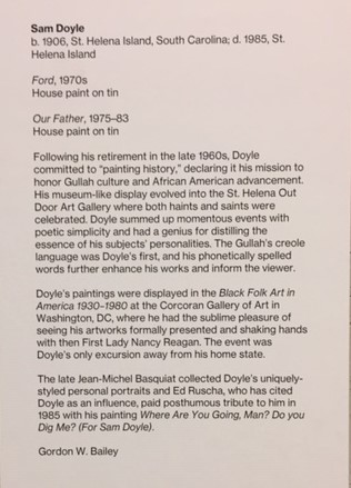
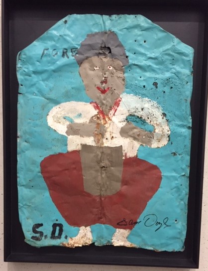
I’m not sure if this is Ford or Our Father
But Thornton Dial, one of America’s most heralded artist of this genre, does not warrant an introduction, simply a by-line. Viewers are not introduced to the richness of racially-charged imagery Dial utilized especially to represent the social liberties taken by women.

Here’s the text of what my student’s wrote about Dial for the incubator exhibit they curated in 2011 at the Frost Art Museum – FIU. Short and sweet, to the point. Viewers get a sense of what his work expresses.
Thornton Dial (USA, b.1928)
Thornton Dial, born in Emelle Alabama in 1928; first came into the art scene, after retirement at 55. Bill Arnett, a Folk Art Collector from Atlanta, discovered his work in 1987 and encouraged him to continue creating; he was the first to put together a collection of his works to be shown.
Thornton Dial uses his work to function as his social commentary, combining African and American traditions to tell his stories. Dial creates sculptural objects and large assemblages using a variety of mediums in his artwork such as watercolor with oil or enamel on canvas and incorporates recycled materials to enhance his pieces, such as carpet, screen, rope, and wire. At 82, Dial is recognized as one of the greatest self-taught artists in the United States and continues to produce works of art; which are displayed in museums and galleries throughout the country.
Quote:
“Art ain’t about paint. It ain’t about canvas. It’s about ideas. Too many people died without ever getting their mind out to the world. I have found how to get my ideas out and I won’t stop. I got ten thousand left.” –Thornton Dial
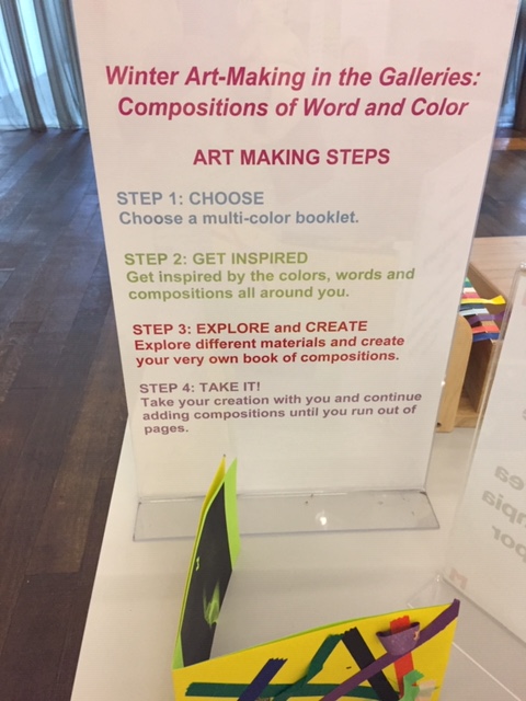
In closing, here’s another example of storytelling? More and more museums are trying out ways to get visitors of all ages involved in the exhibits. This is an activity associated with an exhibit titled What Carried us Over. In the first sign-post, visitors are invited to create a work based on an artwork they saw in the exhibit.
First problem, the workspace was located far from the exhibit. Second problem in the sign on the left, visitors are guided to the work of Sister Gertrude Morgan. I returned to the exhibit and that artwork was nowhere to be seen.
Third problem the instructions (on the right) direct participants to “Get inspired by the colors, words, and composition all around you.” Consider the space where this activity is located and the large, blank white wall it faces.


I came to the museum that day specifically to see, What Carried us Over. I did enjoy the opportunity to see the artwork shown in a small, intimate setting. Here’s the aforementioned work by Sister Gertrude Morgan referenced in the art-making activity. Not only was the activity no where near the art-making activity, it was not included in the exhibit.
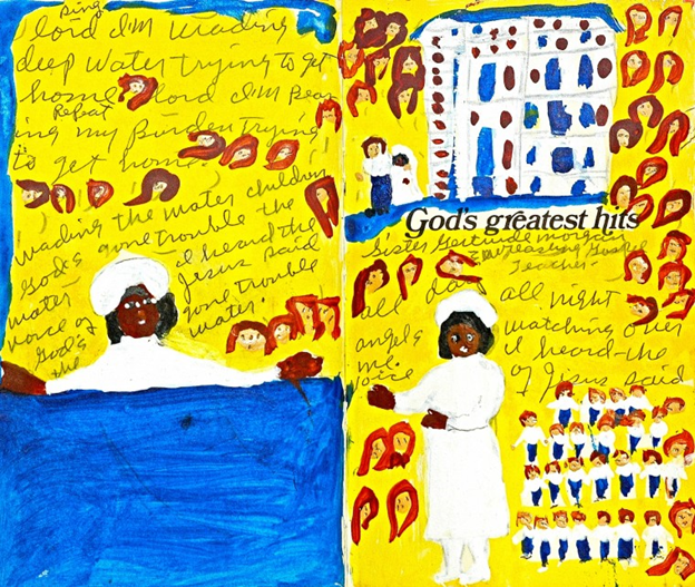
Sister Gertrude Morgan. God’s Greatest Hits, ca. 1970. Mixed media on paper. 9 x 13 inches. Collection Pérez Art Museum Miami, gift of Gordon W. Bailey. Image courtesy of Gordon W. Bailey.
Storytelling is an ancient verbal art. The term has gained current usage in many venues, including today’s museums. Visitors do want to learn something while they see wondrous things. The story, however, should not overshadow the artwork or objects on display. Next time you take an excursion to a museum – whether at home or while traveling – think about how the stories are presented. Also, step back and look to see if others are reading the labels!
